

Making a decision to redesign a cover is not an easy one. A book cover is about capturing potential readers' attention, making them intrigued enough to pick up the book to learn more about it (thereby making back covers very important!) and giving the reader a mental image that will both make them remember your book and give them clues about your book's story. Since most viewing by potential readers is online, a front cover image is extremely important.
My first cover did some jobs incredibly well. It was a striking image and conjured a lot of emotion and comments. At readings and events, it received many compliments and it did what a cover should do - once seen, it was easily remembered and not confused with any other book. It told a lot about the story and about me as an author. Neither the main character nor I play it safe. As one reviewer commented, "It is a compliment to the writer's courage not to take the easy way out..." The Charity also hit number one on Amazon for both Legal Thrillers and Terrorism Thrillers. A significant portion of that success can be attributed to the powerful image of its first cover.

As I got to know my readers, I realized the cover often did not speak to the fervent fans of the story. A recent review on Youtube articulated the seeming disconnect between the two. Many times I had to explain the connection between the first cover and the story. I'll say it here for the last time: Things aren't always what they appear to be and often the worst evil can hide in broad daylight. Check out the hand in the image. It's a real hand!
It's impossible to have firm data on this, but that little 'Spidey-sense' telegraphed that the mark was not a hit. For as many readers who were drawn to the story because of the cover, there may have been those who were turned off. This much I do know and is the hardest to admit: Readers who loved the story said they would not have picked up this book because of the cover. They read it on the strong recommendations of other readers and ended up loving the story and loving Jessica, the main character, but the first cover would have been a deal breaker. Seriously, what author or publisher wants to hear that all of their toil and effort has the opposite effect? The cover actually inhibited potential fans from reading it! It was back to the drawing board, literally!
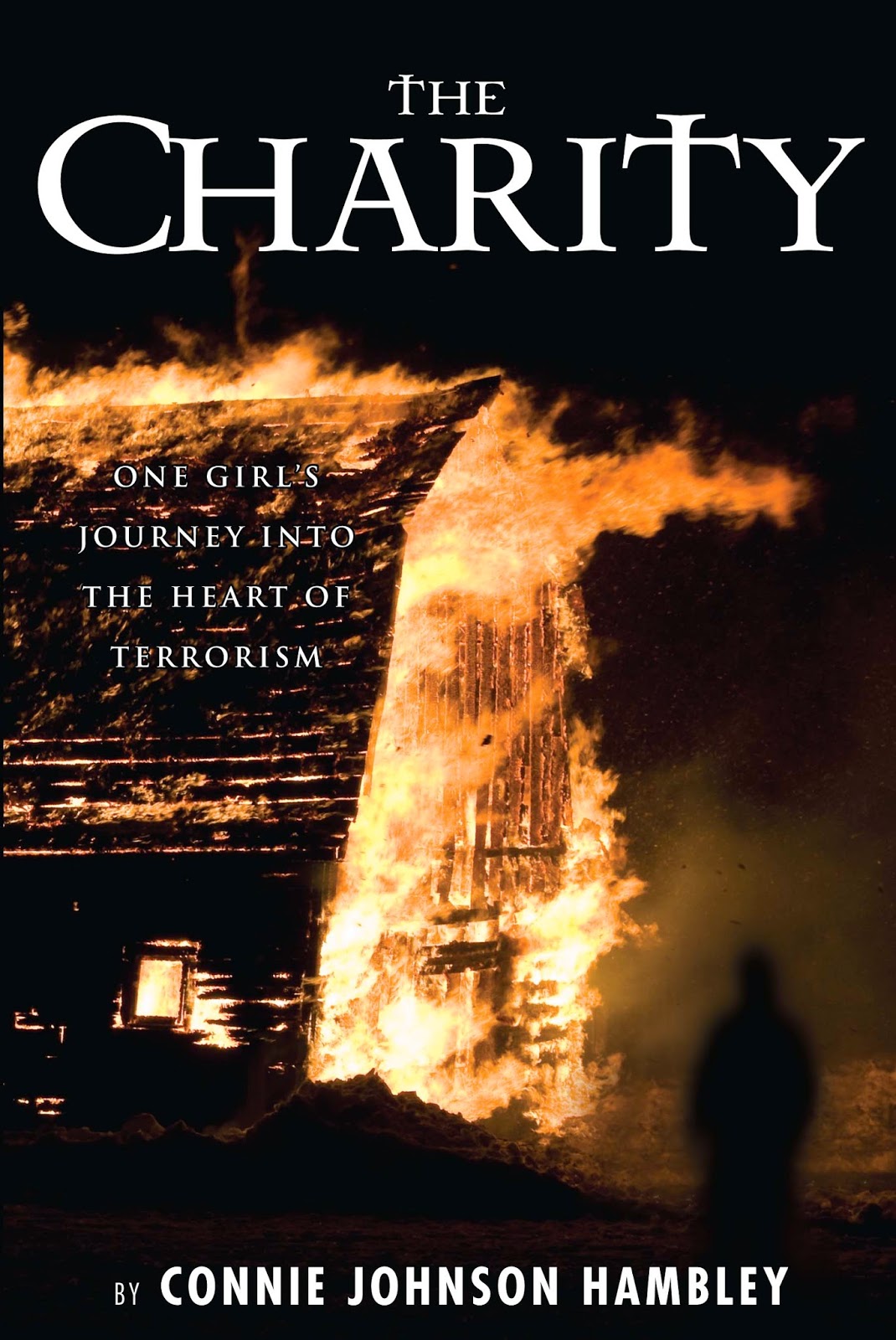
The new cover is getting great reviews. The link between the story and the image is very clear. There is a barn fire in the book and the figure standing calmly watching it all happen is unsettling. Barn fires are kinda important in my personal story, too. If you read the comments on the review linked to above, the reviewer loves the new look and it addresses all of her concerns. I know she's not alone.
One last point about the new cover. I want you, the reader, to question what you think you know about terrorism. I want you to question what it is and why it exists. I want you to question how big an act of terrorism has to be in order to be effective. The most unsettling answer is that sometimes it is the smaller acts that have the biggest influence. Hero or terrorist? Sometimes it all depends which side of the match you're on.
Redesigning the site will be an ongoing process as the sequel moves toward publication. Think of this first step as cleansing your palate. The Cliffs of Moher were beautiful and spoke to the Irish themes in the story, but it was time to move on.
So, Jessica Wyeth, Owen Shea, Michael Conant, Gapman and everyone else is moving on, too. They may have a new look, but their hearts and minds are still the same.
I am very interested to hear your thoughts about the risks and rewards of redesigning a cover. Please leave a comment below.